on
Introduction to Election Analytics (Week 1)
Introduction
This series of blogs leading up to the 2022 US Midterm Elections will aim to predict the outcome for the House of Representatives. This project was created in Gov 1347: Election Analytics, a course taught by Professor Ryan Enos at Harvard University. This first blog aims to explore the two-party vote-share margin and vote swing for the House of Representatives in order to identify changes in voting between the 2014 and 2018 midterm elections.
2014 Midterm Elections
First, we examine the 2014 two-party vote-share margin across the United States by state. We define two-party vote-share margin as the difference between votes for the Republican and Democratic candidate divided by the sum of the votes for the Republican and Democratic candidate. Here, as well as throughout the rest of the blog, red indicates greater Republican votes and blue indicates greater Democratic votes.
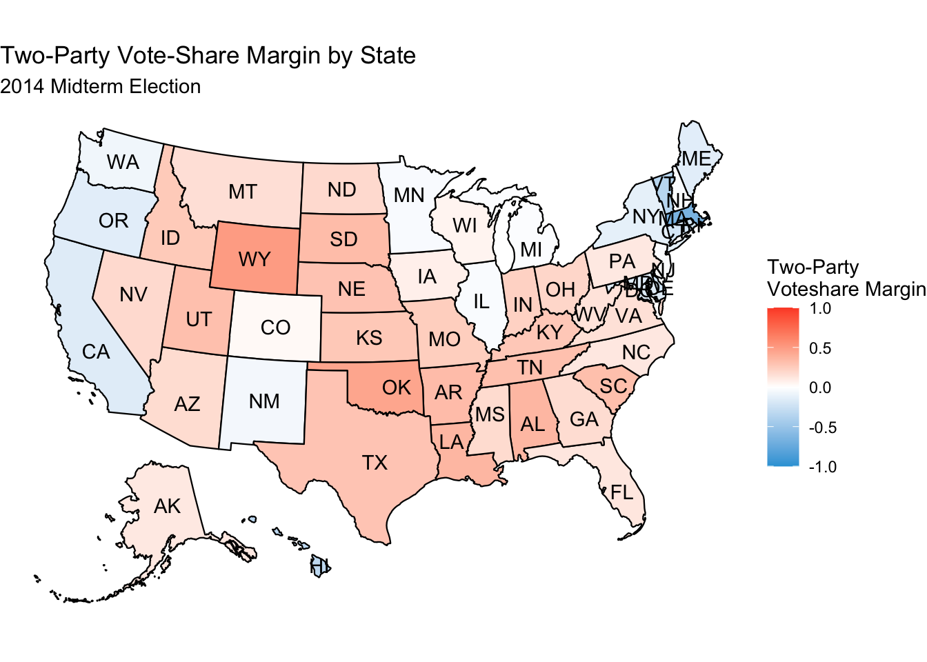
This map is largely as we expect. It confirms the general geographical bias of Democrats on the coasts and Republicans elsewhere, as well as showing that there were quite significant Republican victories across the country. Technically, winning a large vote-share margin is bad for a party, since that means that your voters are clustered in one area and the additional votes over what you needed to beat the other party are “wasted”. This is a problem for both parties, in particular the northeastern states for the Democratic Party, and some Western and Southern states for the Republican Party. This point is better illustrated, however, in the next map, which divides vote-share margin down to the congressional district level for more detail.
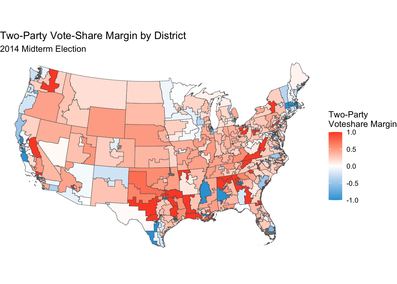
Here, we can clearly see that some districts have a vote-share margin of 1 or -1, indicating that a Republican or a Democrat ran unopposed in that district. This district map also indicates quite a bit more rigidity in who wins certain districts - this simplifies our job of predicting the midterm elections since we can assume that if one party won by large margins year-in and year-out, they’re very likely to win again. That doesn’t mean that there aren’t swing districts, however, these still exist and make the endeavor of attempting to predict the election useful.
2018 Midterm Elections
The 2018 midterm elections made quite a drastic swing back to Democrats, as can be seen in the maps below.
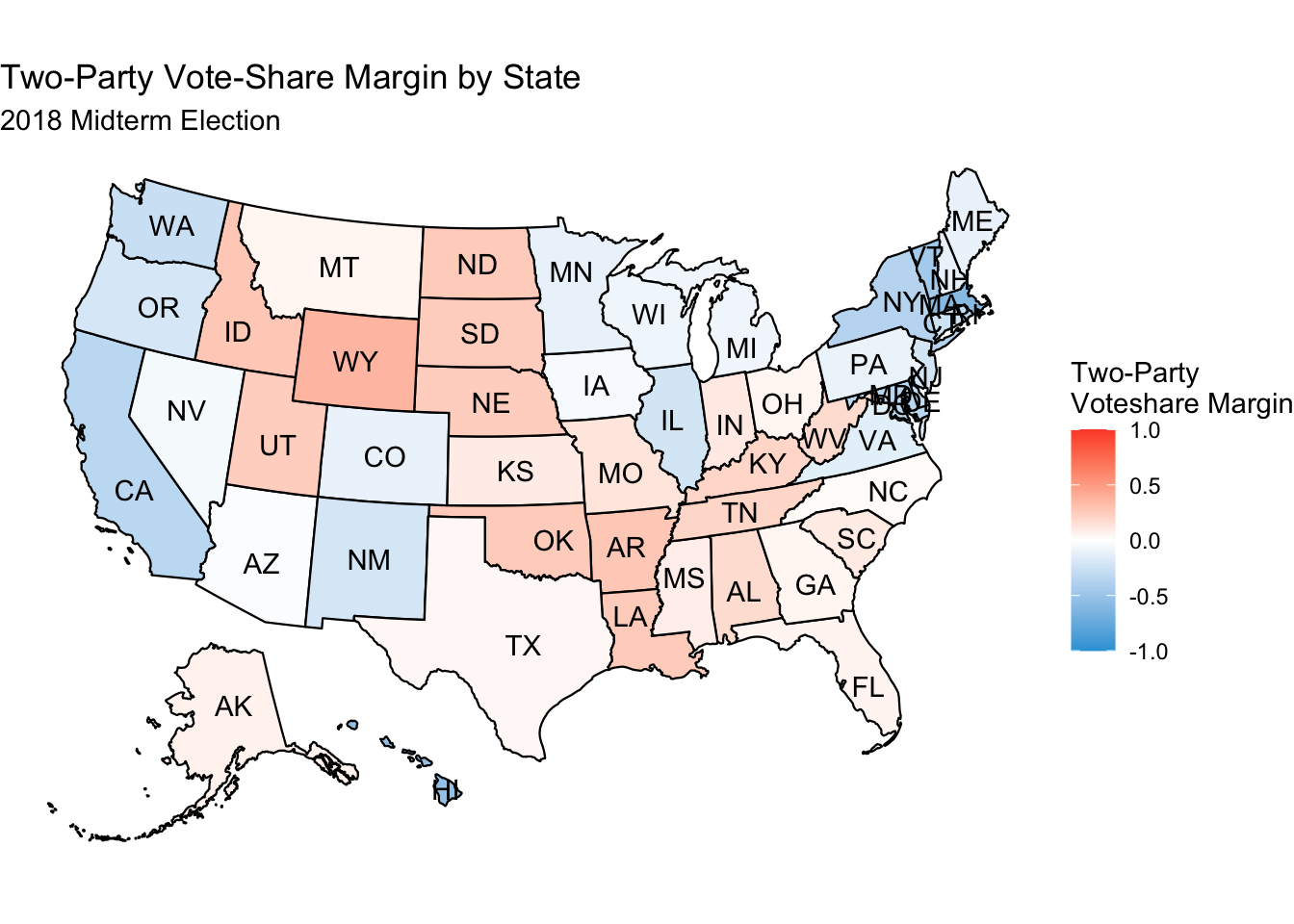
We can see from the above map that Democrats made gains compared to 2014 nearly everywhere, and succeeded in flipping the vote-share margin in states in the Midwest and West from red to blue. This is also shown when we drill down to congressional districts.
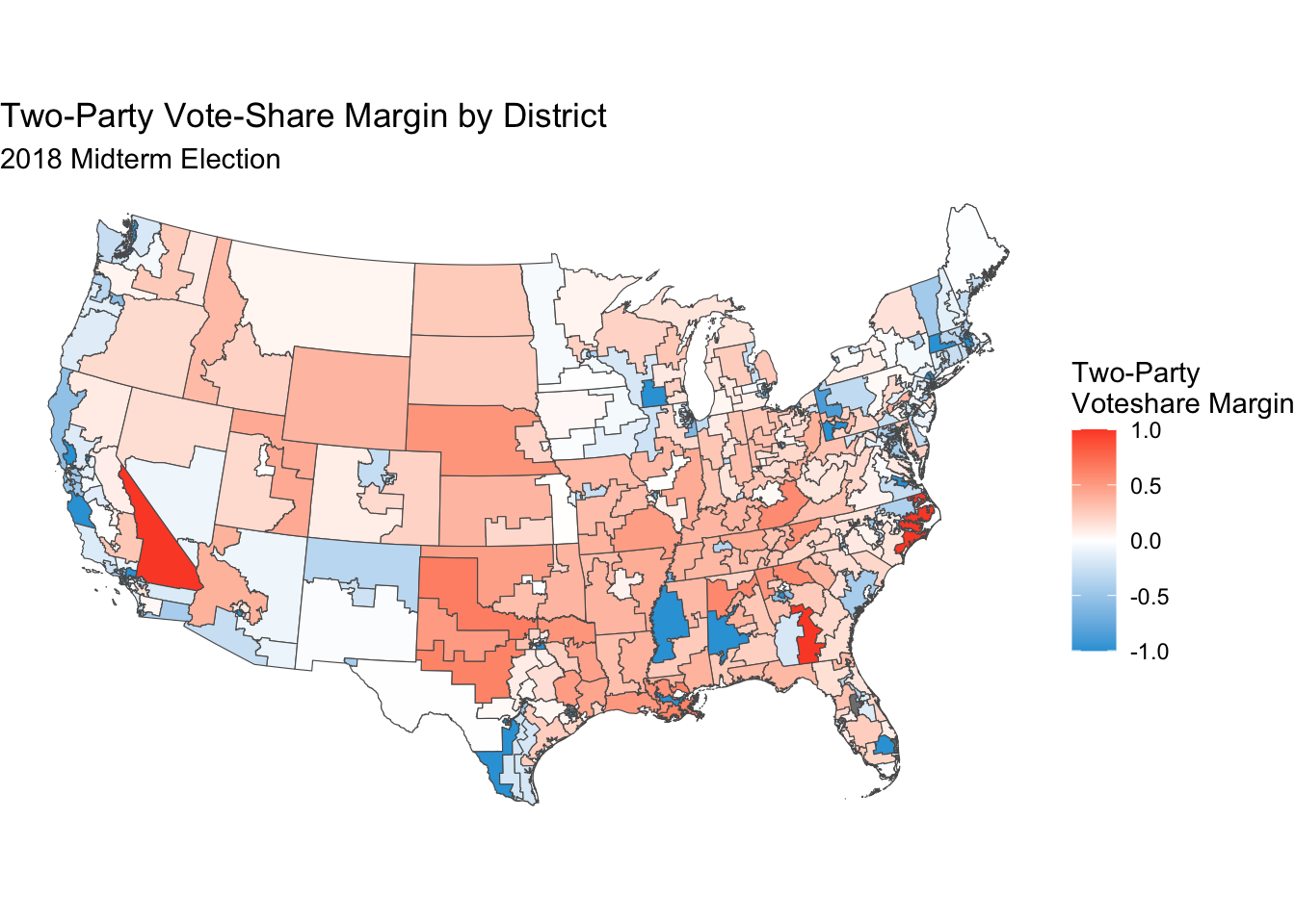
This above map shows another interesting fact beyond greater Democratic victories - the number of unopposed Republican runs fell greatly. Though these seats did not flip by any means, especially throughout the South, Republicans had to face a challenger for seats that they won unopposed in 2014. There are also many more swing districts throughout the country.
Quantifying Swing
In order to quantify the changes that we see from 2014 to 2018, we can use a measure called swing. Swing is calculated in the following way where R and D indicate the respective number of votes for the party and y indicates year:
\[\frac{R_y}{D_y+R_y} - \frac{R_{y-4}}{D_{y-4} + R_{y-4}}\]
Plotting this for every district creates the following map:
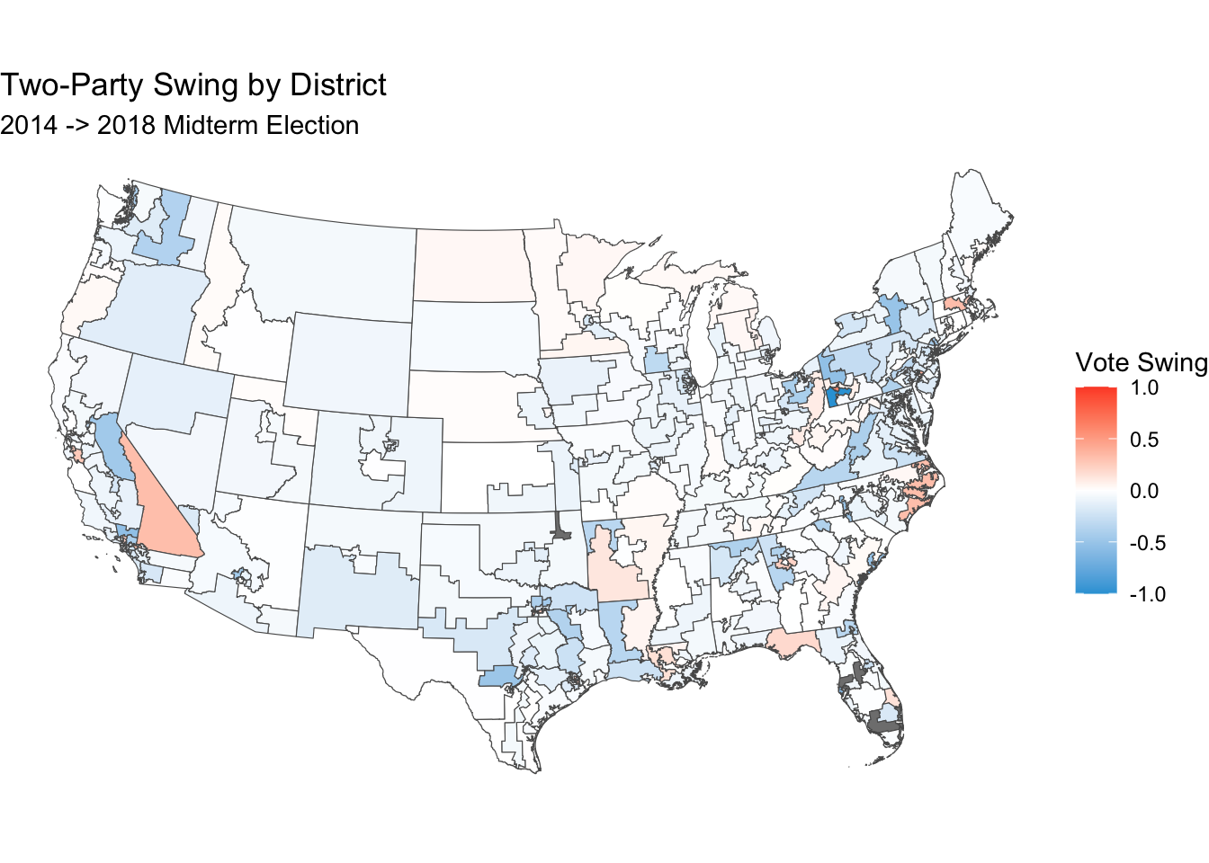
This graph fully confirms the changes that we saw between the 2014 and 2018 election in that almost every district across the country swung blue. The goal for these next few weeks leading up to the election is to work to predict the change from 2018 to this year. As will be shown in following weeks, however, swing is predicted to be nowhere near as blue.